Character Animation
Animation/Character research
To inspire myself I have looked at many different types of animated
characters I have looked at 2D and 3D characters. My research has made me learn
many different ways animation is made, even how they made it in the old days
for the old Disney films like Snow white that came out in 1934. Animation has
moved much more since that point and has become 3D and more realistic from just
at a click of a button, when before they would have to use techniques like
Rotoscoping to get the animation they want which was very time consuming and
also very difficult to get precise. My character that gives me most inspiration
is Rinoa from Final Fantasy VIII. The reason why she inspires me is because I like
the element of wings that she has as a power in the game. The supernatural
touch to her character adds a lot to the character. The influence of this on my
own work is to make a character with wings. I have thought about making an
animation of a phoenix as I could animate the wings really well or make a
character like Rinoa. The wings is a massive element I want to add to my
animation. More over I like her cute but bold personality in the game, she is the stereotypical strong maiden in the game that fights along side the main hero which is 'Squawl' and I want to portray that innocence but fierce power in my character in my animation.

'Rinoa, Final Fantasy VIII, Limit Break'
Others characters that inspire me from there wings are:
One Winged Angel (Sephiroth) from Final Fantasy VII


Valefor from Final Fantasy X

The common theme here is that they all have wings, the reason why I added in a Mythical looking creature is to show the wings in a different form. Further more the mythical creature will give me TEXURE ideas for the wings on my character, how sharp or how soft I'm going to draw the wings.


Symbolism/Structure of Wings
Wings are the symbol of lightness, the possibility of flying and rising up to heaven. Wings are the expression of the aspiration of the soul towards a higher than human condition, in other words the aspiration to transcend the human condition. Wings are related to the cognitive faculty, imagination, thought, freedom and victory. Source: (http://library.acropolis.org/the-symbolism-of-wings/)


These pictures so the structure of Angel wings and how they would function on a human body. They also help me see how wings are supposed to be designed, how to draw them to a real life wing that's inspired by the design of birds the only difference birds don't have the extra arms so it's difficult for them to move forwards as it states, so I will have to make sure of this when I make my animation to get the body movement right.

From this factual image you can see that there is little bone in a wing, the bone in a wing is called the 'Alula' which is shown. This is good information for me because I know there is no hard surface under the feathers so I can draw them as free and loose as possible too portray the look of real wings on my animation.
Vladimir Propps character theory
Who was Vladimir Propps?
Vladimir Propps was a literacy critic who founded the idea of certain type of character was to be used in every narrative structure. His theory has helped many film makers to writing and producing successful narratives. Propp also suggested that all fairy tails follow a certain structure.
Propps character theory
He suggested that each narrative structure had 8 stereotypical character types, these are:
- The dispatcher - The character that makes the evil/darkness know and send the hero on his quest.
- The villain- The character that puts a bad twist on a story, also goes up against the hero at some point in the story.
- The magical helper- The character that joins the hero and supports him throughout the story.
- The princess/prize- This character is key as they are usually the main reason the hero is on the quest. Usually at the end when its all happy the hero gets the princess's hand in marriage. Further more beating the villain means saving the princess ends up in a 'Happily ever after' moment.
- Her Father- gives the task to the Hero
- The donor- Prepares the Hero for what he's about to go up against also can help with him with supplies throughout the story.
- The Hero/Victim - The one who solves the problem and marries the princess.
- False hero- Tries to steal the princess and claim the glory.
Description of each character type :
Villain: Usually has a Mysterious character that's hidden in the shadows as most villains want to sneak up on the Hero and take them down. More over the Villain can also be bold and terrifying so it puts a bigger fear on the quest for the Hero. Villain are usually dressed in dark colours they don't usually stand out as they want to be hidden under the shadows. The main colour for a outfit for them is Black. Also the design of a evil guy is very edgy and based round the shape of a triangle as they aren't a comforting character like circle inspired characters are.
Villain: Usually has a Mysterious character that's hidden in the shadows as most villains want to sneak up on the Hero and take them down. More over the Villain can also be bold and terrifying so it puts a bigger fear on the quest for the Hero. Villain are usually dressed in dark colours they don't usually stand out as they want to be hidden under the shadows. The main colour for a outfit for them is Black. Also the design of a evil guy is very edgy and based round the shape of a triangle as they aren't a comforting character like circle inspired characters are.
 |
This is Xigbar from Kingdom Hearts 2. You can easily see he is a bad guy from his edgy and triangular feartures. Also his dark clothing and sharp looking weapons, more over the scar on his face and eye patch shows even more on that he's a villain.
Dispatcher: This is the character that invites the Hero to eliminate all evil he usually doesn't stand out to much as he isn't a key character so he's usually neutral colours that don't stay in your mind. 
This is Yen Sid from Kingdom Hearts 2. His character is the perfect dispatcher, he meets up with the hero at the very start and gives him his mission straight away and sends him on his journey. His clothing is a natural blue that's not to fierce to look at but shows he's a character of importance. More over there's not much design in his outfit that shows he's not going to be in the game as much as the others.
The Helper: The side kick that helps fight all evil with the hero. The side kick is usually designed a lot like the main Hero, usually bright clothed and has a goofy personality to add humour. 
Goofy from the Kingdom Hearts series has always been a helping hand throughout each game you can see his light-hearted personality shine through from his design the circular shapes of his body make him a comforting character to play as, his shape is that circular it makes his character look dopey and goofy is a dopey character. Further more the bold colours show he's a bold and important character as he's less difficult to forget.
The princess: The character that needs to be saved by the hero from the villain. usually is the damsel in distress and needs a hero to save her.

This is the very famous sleeping beauty, she was digitally animated and put into the game Kingdom Hearts. But as you can see here she is the typical looking princess, long dress, long hair also formally dressed her posture is very up tight showing that's she's posh. Her old necklace and crown show's off her femininity more as a princess. More over the makeup show's the feminine side of a stereotypical princess.
The Donor: This is the character that helps by giving items to the hero like 'potions' or 'First aid packs' it's basically the character that gives the energy boost the hero need.

This is called a Moogle it's a little helper that's at key points of the game to give you potions and lets you upgrade your weapons and even make your own weapons. This character is the definition of the Donor.
The Hero: This character is the most famous and most known, further more its the character that destroys all evil and has a happy ever after ending. His personality is usually very bold and has a big ego as he is the hero and needs guts to get through. Also the main character is the most designed in outfits and personality they don't miss a detail so you can have full connection with that character.

This is Tidus from final fantasy X he is the Hero and also victim of the story but he makes it to the end and saves the day. Straight away you can see his bright clothes that stand out, also his weapon is lightly coloured which shows he's battling his way to peace and happiness, the boldness of the design also shows he's a strong character.
|
 |
| we took photo's to create our own rotoscope, I have been learning about rotoscope and I've found out that this is what they used too do for films |


I finished my own rotoscoping and i added colour, this technique taught me how to see animation frame by frame and how important it is to see each little movement. Also with the coloured one it allowed me to see how the shadow on the colour would change with the movement. More over I also learnt the closer the animation comes the more detail is added to the drawing which adds alot of effect. In Photoshop it also taught me how to add animation by using 'motion' and making me each and only frames.
Life drawings


 https://www.youtube.com/watch?v=5Wn85Ge22FQ
I finished my first rotoscoping early so i took a fragment of a music video and cut it up into frames and added
my own colour to add a real life but also cartoon look to it, i found it really fun to make.
Walk cycle

A walk cycle breaks down a person or animal walking frame by frame, allowing us to see the movement and also
make our own and draw it out. Also it shows us muscle structure of the body and the movement of it.
 |
| This is a drawing I've worked on in my own time I've put this in my work to show the standard of my Photoshop drawings, it's not finished but you can see how much detail I've put in from my guiding lines. Hopefully i will be able to get my animation to this standard in quality. Rotoscoping  The technique of rotoscope. In my research I have found more in depth explanations out rotoscope. the technique I'm about to explain is the traditional way of rotoscope where as I'm making mine on Photoshop. Tracing an object the movie maker creates a silhouette 'called matte' that can be used to take that object from a individual scene for use on a different scene for use of a different background. Blue and green screen techniques have been made the process of layering subjects in scenes easier, rotoscoping still plays a large role in the production of visual effects imagery. Rotoscoping in the digital domain is often aided by motion tracking and Onion skinning software. Rotoscoping is often used in the preparation of garbage mattes for other matte pulling processes. Disney is well know for using rotoscope in the early days they used to get actors/actresses to act out the scene and they would either live draw it or takes many pictures at such a fast speed then rotoscope them later. The very first Disney film ever made which was Snow White in 1935 was made this way  Peter Pan 1953  Sketches/Ideas |
 |
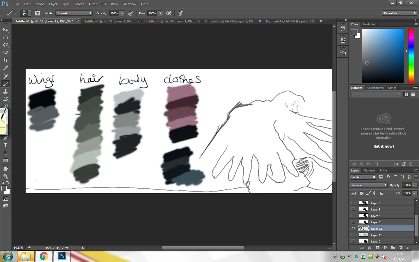
| With the theme round wings I wanted to start drawing up ideas so i know where I'm going with the look of my character at starts and the body portion of my character i used this picture to draw because it shows half of the body and also allows me to still put much detail into the face. I painted the wings in a different colour to make them stand out and show how I've added them into my draw as a nice asset also to show how I'm adding my own project ideas into my upcoming sketches. |
 |
| What i like about this sketch is the nice portion in the body it allows me to add the same amount of detail throughout my whole drawing. More over I like the pose the drawing is in it allows me to show perfect portion for example the size of the hands compared to the chest or head. Also i like how the angle wings fit really well into the character they look like they are meant to be there, further more the atmosphere this picture presents really captures the viewers attention. |
 |
| I really like this sketch because the image itself allows me to show shading so well, the shading in this sketch adds affect and makes you think what type of character he is. The contrast in the shading makes him look evil because how the side of his face is completely covered by the dark where as the other side is completely exposed to the light. Also with how close his face is this will allow me to add a lot of detail to his facial features and really capture the essence of the character. Even though the wings are not on fully show I like this because it makes you feel smothered by the wings like the picture is trapping you in, the wings being so close will also let me work on the texture and look of the wings it will allow me to capture the softness of the wings in my drawing. Overall this is my favourite sketch yet as it has so much potential to become a really effected drawing. |
 |
| This sketch was just a trail in using different types of wings. I wanted to used butterfly wings to show a different type of aspect to a drawing the butterfly show a soft side even though the character himself is quite harsh looking but the butterfly wings add a touch of sweetness to the character. I also wanted to show the diversity of wing types and that I'm not just sticking to the generic 'Angel wings'. Story Board   My animation is going to be based around these two scenes my concept art is inspired by the last box of story Board which you will see and my animation is the scene from the story Board on the left side.My finished character idea
As you can see I carried on with sketch 3, I did this because I really liked the idea of the character and it having animation. Further more I like the shadow difference throughout the whole drawing, the one half of the drawing is very dark and has dark colours how the face the side of the face is much darker to the rest. This is also shown in the wing and hair, the right wing is black and dark blue/green and the hair is a dark/dead looking blonde this shows much effect in the fact the character has a dark side to itself. The contrast of the light side which is the left side of my character shows more of a side where my character maybe good and is being embraced by evil. The light side also lets me experience using a lighter pallet of colours so the drawing itself lets me really stretch my art skills and I know it will look good in animation. The picture I got for my drawing is from a music video and i drew my own version of it to the best of my abilities so the look of my character isn't my idea it's inspire from a music video that I'm looking at using for my animation in using rotoscope. The drawing of the image is done by me free hand and i made my own colour pallets to get the colour of it so precise. I'm looking forward into making this a animation for my end piece.
|

Starting the animation
 |
| On my phone I screenshot the part of the video i was using frame by frame and emailed to myself I may not need all frames but i have them all just in case. For my animation i'm going to rotoscope this part of the video. I'll put a link to the video of where i got it from. https://www.youtube.com/watch?v=RuntXwPvvaE |


 |
| These first print screen is the frame normal what the original looks like and the second frame is my painted version of it. As you can see the wings are not as sharp as they are in the original I did this because i wanted to show the quality of the brush I was using further more it shows the softness of wings and feathers it really captures the softness of the wings. The colour of them in this frame is fully black but the softness of the brush makes them less harsh to look at where as the colour of them is harsh. |

This is a close up on the wings i painted in the 3rd frame here you can see how i captured the very rich but dark blues in the feathers that are more exposed to light. Also on this close up you can see how i painted his body, I painted it in blocks then use the blur tool to blend them together. On the arm you can still see how the block of colours has perfectly blended out and still loom at little blocky in the colour shade but that's a good thing because it shows the essence of cartoon animation in it. Further more near the ridge of the wing i used whites and greys and made them look really blury so it shows there moment in the wing that the eye cant process the amount of detail in this frame as the wing is in movement.
 |
The reason why I print screen this part of the frame is because the colour of the liquid is symbolic in the video and i didn't want too miss it in the my animation. The colour green
The negative things to do with the colour green are really highlighted in this animation because the story behind this animation is the fact the character has given into his temptations these temptations are wealth and fame, because of these temptations he has gained wings but they are black showing they are not pure and not natural that he's gained these from a dark source.
The negative things related to the colour green:
possessive and materialistic, indifferent and over-cautious, envious, selfish, greedy and miserly, devious with money.
This is why the liquid coming from his wing is green to show the deal he has made is from greed and selfishness and the colour green represents this without words having too. There are obviously positives to the colour green, they are:
growth and vitality, renewal and restoration, self-reliance, reliability and dependability, being tactful, emotionally balanced and calm, nature lover and family oriented, practical and down to earth, sympathetic.
The positives shown in this image with the colour green are growth, self reliance as my character is growing with his wings to the next part of his life and self reliance with he has his own life in his hands and he controls what happens in it which also links with the negative part of being possessive over his own life.
 |


My finished animation

The requirements for this project was too make a solid and good quality animation that was 10 seconds long which had to be designed around my character I have made. My project was bases around the theme of ‘wings’ my character has wings and the wings are the main element of it. My project was also inspired by rotoscoping and the technique and how it’s done I did alot of research of this so I could make sure my animation would be the best it can be with that technique. More over I showed the symbolism of wings and the different types of wings there is too show the diversity of my project that it’s not so straight forward as it seems that there is many choices.
I got my idea for my project when we started looking at rotoscoping and I had many ideas on what I could possibly rotoscope and make come to life in my own drawings of animation. I was also inspired by Disney and how there bought the real life drawings they did into there most famous style moving on from that I started looking at videos that I would find inspiration in and that I would enjoy rotoscoping knowing I would do it too the best of my ability. The video I chosen had the element of wings in it and a interesting character I knew of course work with, also rotoscoping it would also let me do my animation the closest to real life I can that’s why I picked the video I did as the small scene I had taken was real life. The experiments I did towards my project was one I took photos of myself walking so each frame was each point of a walk cycle then I rotoscope them to make myself into a small animation my other small project I did was me practising rotoscoping from a video I screenshot frame by frame and made into an animation with the element of real life and cartoon. The materials I used for my experiments was cameras and paper to note down each from and what point of a walk cycle it was. The software I used to make my animation was Photoshop this is because it allowed me to be able to paint each frame to the best of my ability and I didn’t loose and detail down to the software I was using more over Photoshop has all the tools and equipment I need for my animation and even more the biggest part of photoshop for me is that it has the motion setting where you can pretty much create your own flip book and this is how I made my animation frame by frame. Also what helped with photoshop was the amount of different brushes you could use this allowed me to fully grab the texture of the wings in my animation when I was painting it. The main technique I used was rotoscoping which I’ve explained but also I used the technique of calligraphic which is where you don’t take your pencil of the paper and also where you use 2 pencils at the same time. For my frames I worked in ones, my whole animation is a perfect look but for just one play through of just used each frame once at a time speed of 1 second. I used ones because it fit my animation more I didn’t need to slow it down or give it extra time between each scene. The persistence of vision is when your mind thinks it’s real life movement that it’s actually not frame by frame that it mover like that all in one frame, more over because we made the animation ourselves we know there is frames to make that animation even though to the eye it’s difficult to believe. The specialist terminology I have learnt is the onion skin technique where your putting layers upon layers for each frame, I’ve also learnt the Propped theory with the theory of the perfect setting of characters in a story line. The reason why my animation runs so smooth is because I broke the frames down so precisely that there would be any uneven frames where it may jolt and not run smoothly also I made sure that the colour and the painting between each frame was as close as possible so it didn’t seem out of place. The things that influenced me to do a project around wings was I already have a massive interest into wings and I wanted to put it into my project also just a simple flip book I made inspired me too and that’s why I wanted to make something frame by frame. I also like the drawing process of rotoscoping and I wanted too do this on a professional level for my project that’s why it influenced my project. The choices I made while creating this project was the frames and which frames I was going to used from the screenshot bunch I took also how long each frame was going to be if I was going to do it in ones ore twos, I also made the decision on what shapes I was going to Base my character around and what this would portray to the viewer. More over I chose the personality of my character that he’s dark and mysterious and also dangerous but also gullible if you look at my story board, the colour scheme was another thing I chose, I kept it too the original so I still captured the dark element the video does too. These choices effect my animation by the colour and by the look and how I portray him all round. The major problem I had when making my animation was making sure each frame is as close at possible to the next one I didn’t want to make it jumpy or random that each frame looks completely different more over the placing of my character in each frame was also difficult and I had to made sure he was sitting in the exact place from the last frame. I solved them by keeping one of the frames open while doing another one so I can always look back at it too double check I’m doing it to my first frames standard and that I haven’t gone too far out with it.
I was happy with my animation because it’s on a perfect loop so it carries on forever also I liked the standard and detail that went into the drawing of my animation that really stood out from me that I could keep that stage of detail throughout the whole animation. The bits of my animation I liked the best was the wings this is because they stand out and I wanted to make them the highlight of my animation further more I liked the painting techniques I learnt when painting the wings and how to successfully make a soft looking texture in Photoshop, more over I like the colours I used for the wings even they are dark the colours still stand out and the highlight on some off the wings really stands out and has a lovely effect. There wasn’t really a part I didn’t like I just wish I could rotoscope more if I had more time that I could rotoscope a whole 20 seconds for my scene if I had more time. The part I enjoyed the most was the process of the rotoscope watching it come all together was the best part for me altogether. I feel like I did managed my time properly and effectively because my animation was fully complete and too a very good standard, over all I really enjoyed the project and I’m proud of what I’ve produced and my animation has been inspired by ideas that I’m really passionate about.
No comments:
Post a Comment