


I've been working on some mind maps just to give my ideas space and I can begin looking into the ones I'm more interested in, I'll start doing small sketches into what I'm looking into and after that I will cut the ideas down into the ones that grab me the most.

The ones highlighted green are the ones I'm going to working into further, because I feel like I have more potential with them. Next lesson I will be doing sketches and I will be gathering images from other games that have my ideas in as reference.
 |
| Working on idea 1 |


Working on idea 4


Idea 7
The different types
So I started looking into the different types of heartless so I can look into the the different art styles and art designs and they took the influence on each type of heartless, as we can clearly see they common theme is a slick body or a part of the body that's spiky and slick.

So I started looking into the different types of heartless so I can look into the the different art styles and art designs and they took the influence on each type of heartless, as we can clearly see they common theme is a slick body or a part of the body that's spiky and slick.

The colour scheme is also a clear link between each type of character the colours they use as well are dark and mysterious which clearly shows they have some form of bad role in the game.
Logos
Logos

Colour schemes
I started to break down the colours to see what was the main that's used and if they had a clear colour palette, so from what I have done It's clear to see on this that blues and purples are a clear colour in this one design. I also like the small details they have added like the small skulls on the shoulders and the bandanna which shows that it's of a pirate themed level. The reason why I have done that is because it will break down the colours for me and let me see what choices of colour I have.
I started to break down the colours to see what was the main that's used and if they had a clear colour palette, so from what I have done It's clear to see on this that blues and purples are a clear colour in this one design. I also like the small details they have added like the small skulls on the shoulders and the bandanna which shows that it's of a pirate themed level. The reason why I have done that is because it will break down the colours for me and let me see what choices of colour I have.

With this one yet again the main colours are blue and purple, there is also a fair share of pinks in this too, the purple slowly turns into a hot pink on some parts of the monster. I like this added colour it gives it a poisoned look which makes it look more threatening.

I picked this monster because It has soft colours and I liked that it was very different to what the other ones had shown, with this one there many soft cream colours which a essence of magic to me, I did that because it reminded me of a white mage.
 |
| Quick Sketches I did some basic sketched and draw ups of what my ideas looked like I only used basic material like crayon or felt or pencil, I did more silhouette ideas, then a full on drawing because I did have a solid idea. |

The nice thing about sketching up in felt is that I can add a lot of shading, and add definition to my drawings.

I found a few heartless designs that I like so I started drawing the one up that I liked the most I was really happy with the drawing because I really captured the feel of a ghostly form with design, further more I'm also really happy with the shading I have done because it shows the definition of the different parts of the body on the monster ghoul.


New and Final Idea

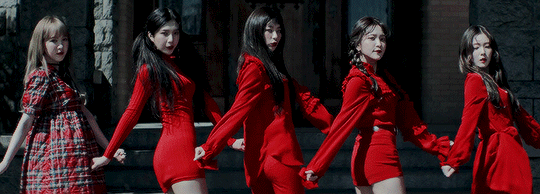
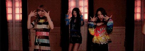
So my new idea is too create my own design of doll inspired by a back story that is catching. This idea started from when I remembered a music video that came out last year that was based around the myth of "death Mansion" it's a myth that's not very known by the music video 'Peek A Boo' by Red velvet is based around it. I'll start with explaining the myth, the myth is based in the Victorian time and it was about these 5 girls that lived in a Mansion that used to belong to there Father, The father abused the girls because the Mother/ his wife died after having the youngest daughter and he always blamed them for losing the love of his life. In the end the 5 girls ended up plotting against there father and killed him and kept his T shirt as a reward, after this the girls continued to draw men into the mansion and kill them and keep there tshirt as a trophy the girls did this until they all drank a poison in there 30s and died together. They didn't get caught while they were alive but the Myth still stands till this day. So what I'm planning on doing is creating some form of creepy doll/ porcelain doll based in there image as if there spirit is with in these dolls. The main design I'm going to base after the Red Velvet girls in the music video because it's very accurate and I love the concept they have created for the Music video and I want to add to it.
Introducing the Music video
( and how my ideas are going to work with it )


Screenshots
The reason why I did screenshots is so I can point out each little bit of the video that personally catches my eye and makes my ideas spark up and where I go the influence in the ideas I'm going to produce and to also introduce the person looking at my blog to where and why I got my idea.


 |
The History of Dolls
The reason why I have added this to my blog is because to show how dolls have changed over time and how the influence of the dolls over time and what they have kept in design and why they they made dolls the way they did back in certain times.
The reason why I have added this to my blog is because to show how dolls have changed over time and how the influence of the dolls over time and what they have kept in design and why they they made dolls the way they did back in certain times.


Meaning behind the colour
The reason why I have added this into my blog is to show that I understand colour theory and that I'm looking out and into the colours that I'm using and that I'm full aware that what I'm creating I fully understand. This is because I don't want to lose small details in my work.
The reason why I have added this into my blog is to show that I understand colour theory and that I'm looking out and into the colours that I'm using and that I'm full aware that what I'm creating I fully understand. This is because I don't want to lose small details in my work.


The reason why I'm showing the different colours of shades is because I want to show that there is going to be a vast shades of red in my art, not just basic and saying red.

Top 10 fabrics/Clothing research
The reason why I have added this in is because I want to show that I've looked into the material and that I'm paying attention to detail when I come to draw the detail on my painting because i really want to capture the texture fabric can have and I want people to be able to tell what type of fabric I am drawing.


Here are some fabric designs that I practised, I did this so I could show the range I tried to create.
Realism art
The reason why I looked into realism art is because I'm going to be using it for my final piece I found this amazing website that gives an amazing explanation about where it started and how it evolved over time! That's why I have put up screenshots to show the website because the information really helped me.


The difference between the two
The reason why I have done this is because I want to be able to show I know the clear difference in what what I'm researching, I want to show that I am aware of what I'm wanting to paint.


Inspiring artist
The reason why I have added this artist in is to show I am looking into other peoples work as a influence to what I'm going to create and also show what I find interesting and how I can link it to my project.
The reason why I have added this artist in is to show I am looking into other peoples work as a influence to what I'm going to create and also show what I find interesting and how I can link it to my project.

Real life influence

So my best friend the Instagram model she is let me use pictures of her form my blog because he makeup is so good and so doll like that it has given me a lot of influence in how to draw the doll eyes on my finished piece and hold a lot of attention to detail when it comes to like the detail of the corner of the eyes and the shine on a eye. you can find these pictures @kanashimi.ao on Instagram.


Some more examples of doll eyes, the basic of this makeup is to make your eyes look bigger and they do this by putting a lot of white makeup on the bottom of the eyes so I will do this for my finished painting.
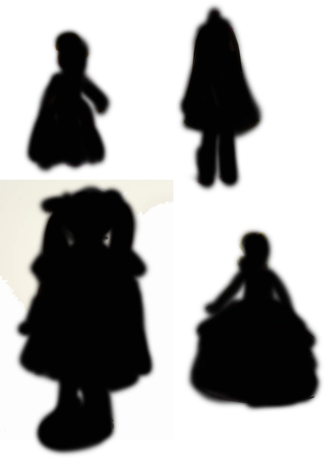
Sillohettes
I did these to work out what type of frame I want my doll to be in, so I quickly marked out some silhouettes on how the body of the doll could be framed. when I can find a wooden mannequin, and change the position of it to show what possible body movement my doll can have.
Test run

Colour palettes I'm looking to use
So I have black many of the colours that will be correct to use for my test run and final piece down the line, it's clear to see that reds and purple are key and that some bronze colours and yellows are also a key colours in this palette.

The brushes I hope to use/ones I always use
So these are the brushes I always seem to use so, I like using these brushes because they supply texture and that is great for the detail in the dresses and the hair. I usually use a mid sized brush as well and the opacity is usually at half so I can add shadows and definition easily while I work.


Key Colours:
- Red
- Purple
- Yellow
- Gold
- Black
- cream
- grey


Starting my final piece
So after blocking out my colours and using a doll as a template I started working on the face of the first girl. It was so nice to do a practice because I knew what I wanted to improve and what I could jump straight onto, what I wanted to improve on this from the practice run was the eye's I wanted the eyes too look more doll like so hopefully after working on them for a while I will capture the eerie look in the dolls eyes.
 |
| I'm happy with how I've done the hair with the different brushes I will show what brushes I used when I've finished and I'll explain over why I have used them. |
 |
| The eyes are coming along nicely I love the shape of them and how I've added a a glassy shine over the eyes, also I've added the main structures to the face, I've painted in the nose and the mouth I really like the shade of red I have for the lips It makes the face look more pale. |
 |
| So for this I added alot more character in the face and the expressions it had, I wanted a slight worried look so it would add a little sense of discomfort when you looked at because you want to know what they are so worried about . |
 |
| So I started adding to the dress started blocking out shapes and getting the shading on the fabric, and put my practice of fabric to work. Also working with the colour red has really made me fall for the colour red and I love having it around me I find the colour really energising. |
 |
| I've started drawing the next face and I've done the same process that I did for the first and I'm happy again with the shape of the eye. |
 |
| As you can clearly see here that I'm going to start working on both dresses and start putting a lot of detail in that I learnt when I researched into different fabrics. |
 |
| A small close up to their collar of the of the 2nd doll you can see the small detail I've added to the collar, I've used the cross hatch, I've done this so I've try to make it as close to the fabric as possible. |
 |
| Here are the finished dolls, as you can see I've done much detail to the dress and the hair I really wanted to capture the folds in the skirts, I also added legs on the dolls they were really basic to paint it was a simple colour palette and the skills from painting people before came in to hand when I did that. Over all with the finished dolls I am really impressed with what I have finished with, I made the hands slightly to big to add a bit a uncanny valley which adds so unease to the painting. |
The setting of my finished piece
I didn't show my work in painting the background because I was in a creative flow and honestly forgot to but the is what I have done I wanted the dolls to be the draw of attention to the piece of art I really like how I have added the picture of the idols in the background so it shows that the dolls are them or it makes you think if the soul of those girls have taken over the body of the dolls. The reason why I added the chair in is I knew i could easily make that look really eerie and I had ideas of adding spider webs to the chair and I wanted to pull that out and add it to the dolls. For the spider web I found images on google and started coping what I saw and I was really happy with what I completed and finished with. The writing on the wall again adds elements of eeriness which I can't help but love, and with the touch of the candles it just gives a little more of a spooky vibe that if the house hasn't been touched in years then how are the candles still lit

The final piece finished

Evaluation
So the project was to pick a idea of our choice and do full length research into it and create a 3D or 2D piece of work, I decided to pick a 2D piece because that is where my talents are higher in and I'm much more confident with Photoshop painting then I am with Maya. The biggest influence for me was the music video 'Peek A Boo by Red velvet' and the story behind it, the story really captured me and eeriness of it was something I really wanted to show in my work, so at starts I broke the video down and started looking into the key features of what I liked about the video. The one thing I did notice was that they all seemed like dolls in the music video and that's why I chose dolls to do for the finally piece mixed in with the music video. I ended up creating dolls inspired of the girls from the music video, I wanted to capture the emotions they portray across in the music video in my art work so that is what I did. The art style I used was realism, I used this because I wanted to hit the element of it being eerie and if something seems fake or cartooned it loses that to it when if it looks real then it makes it question if it actually happened or if it was to happen to the person viewing how would they feel that's why I used the art style of realism. A artist that I did look into was Lance Phan I looked into her work because I liked the CGI on the eyes that really captured me and I wanted to put it into my art. With this the only issue I came across was because of how dark my set was, it was really difficult to get that glassy doll look in the eye. To understand the project I looked into different fabrics and different typed of dolls and I also did a lot of work on colour theory and understood the colours I was using so I would portray them correctly in my art work. The primary research I did was fabrics and colour I made sure they were done first and that I knew how to use them and how to capture the beauty of them in my art work. The secondary research I did was to do with the different dolls and how they have changed throughout history. I used Photoshop for the main piece I used most of the brushes in photo and I also used the image tools where I could change the lightning and the contrast. The software I used was effective because I knew how to use the brushes and I was confident in what I was going to create. All the tools that I used were effective and they did help me get the finished look in the details that I wanted, the only problem I came across was that I got confused with the different layers and I had trouble fixing some mistakes that I made on my drawing, but I found a solution and made my way around it to clear up my mistakes. I also did some small research into Photoshop and the brushes which helped me a lot and helped with giving my finished piece of art it's final polish. The one thing I did not like about my work was how dark I made the scene I think I lost a lot of the detail I put into the dresses bit at least it added some more to the eerie effect, to develop this further I wish I could have added some more candles on the bits that were dark so I could show the detail in the light of the candle. The main bit I did like was the way I drew the dolls I think I really captured what I wanted from the start was the eeriness of the dolls and that they look like Joy and Seulgi from the music video, if I could work further on it I would have probably worked on the eyes a little more but other than that I was happy, I did feel like there was a massive down fall with the fact we didn't have a tutor for a few weeks and then we only had a replacement that wasn't even specialised in what we were doing so personally I found that my work could have been so much better if I wasn't let down by lack of support on the course, but I still pulled out the best of what I can with what I had. Next time I would spend more time analysing my work and going over things I have done. With my research I feel like I have done enough because it was enough to go towards my finally piece and I did help me a lot and push my skills much more. The research is on my blog and it is visible to see that I have do my research into the things I've too. I do believe I had managed to do enough experiment because it gave me the boost I needed for my final piece. Overall I am happy with my final piece.
Bibliography
https://www.youtube.com/watch?v=rnMtbIz-H-0
– Thumbnail
https://www.youtube.com/watch?v=Xo3gnnrPh4M - Thumbnail
No comments:
Post a Comment