Sublime
To Edmund Burke a scholar of the sublime. The art works must contain darkness this will point out the bold in a image also dark colours make a picture very solid in colour and make it look vert strong. Obscurity this confuses judgement privation or deprivation since pain is more powerful than pleasure. Loudness which overwhelms us with emotion about the art work, also it can send a message across too that It's trying to show something. Suddenness shocks our sensibilities to the point of disablement.
Altogether the sublime is how you experience the art work what emotions it gives you in the first 10 seconds you lay eyes onto it. Most art pieces that have strong sublime are landscapes as it can make you feel more at wonder.
Here are some powerful painting:

This picture gives you fear and fright at you know it's a sea storm which is dangerous and could kill many people.

Same again with this one, its a world disaster which gives you fright and worry straight away.

This gives you a sense of wonder at what is he looking at and what is son important of that cliff, it also gives you a sense of loneliness.
Forms
Dominant Forms

The Dominant Form is usually the largest ,as in the image and the first thing your eye is drawn too. The dominant form is normally placed off to the side and never in the middle. In the picture i have chosen the main character is the dominant form, this gives you a straight idea about what the game is about also draws the person to first so it has to be interesting.

Sub-dominant Forms are placed to balance the dominant form and are usually smaller but they are still bold, in this picture they are the flames in the background they suggest a story of the game but still it's not the main thing.

The subordinate Form will allow your eyes to follow from form to form before resting at the subordinate form. The focal point is often, but not always the subordinate form. In this picture the subordinate in this picture is the planet behind it this fills in the whole picture but doesn't take it over.
Colour Theory
The colour wheel

A colour circle, based on red, yellow and blue, is traditional in the field of art. Sir Isaac Newton developed the first circular diagram of colours in 1666. Since then, artists have studied and designed numerous variations of this concept. In reality, any colour circle or colour wheel which presents a logically arranged sequence of pure hues and merit.
There are also categories of colour based on the colour wheel. We begin with a 3-part colour wheel.

Primary colours: Red, Yellow and blue
In traditional colour theory, primary colours are the 3 pigment colours that can not be mixed or formed by mixing the primary colours.
Secondary Colours: Green, Orange and purple
These are the colours formed by mixing the primary colours.
Tertiary Colours: Yellow-Orange, red-Orange, Red-purple, Blue-purple, Blue green & Yellow-green. These are the colours formed by mixing a primary and secondary colour.
Colour Harmony
Harmony can be defined as a pleasing arrangement of parts, whether it be music, poetry and colour.
In visual, harmony is something that is pleasing to the eye. It engages the viewer and it creates an inner sense of order, a balance in the visual experience that is bland that the viewer finds in boring or busy. The human brain will reject under-stimulating information also extreme visual experience can do the same. It has to be balanced out to a harmony.
Composition Tips
Golden Spiral
 This was a mathematical way to break a picture down and lead your eye to a certain area of the image.

Rule of Thirds
Rule of thirds is a good way to break down how much is
going on in the picture in this picture of the field I've
picked you can see the sun is around the middle box and
and middle right.


I found my own photo and used the rule of thirds to show that it's true that the main action is in the middle and to the right squares.
Concept art
This mini project is for us to try new techniques for our German expressionism. In this project we are using one point perspective. This will give us the technique of eye manipulation to think it's 3D when it's actually 2D.
 |
| This is my sketch so far, I used a road to easily distract the eye to follow the road. the road is a dominant form to take the eye straight to the tunnel the end of the road. My idea for my subdominant form will be the side of the buildings when I add more detail. |
 |
| My finished piece, my dominant form is now the tentacle I added this because it's eye catching and it adds colour to it. Moreover if you added the rule of thirds over this it would be in the middle right boxes which is where most on the main form should be in a image. |

German Expressionism
Expressionism was a modernist movement, it started in poetry but led into art. This movement originated in Germany at the beginning of the 20th century. It's typical trait is to present the world solely from a subjective perspective, distorting it radically for emotion effect in order to evoke moods or ideas.
Expressionism was a modernist movement, it started in poetry but led into art. This movement originated in Germany at the beginning of the 20th century. It's typical trait is to present the world solely from a subjective perspective, distorting it radically for emotion effect in order to evoke moods or ideas.
The most famous German expressionists are Max Beckmann, Otto Dix, George Grosz, Ernst Ludwig Kirchner and Emil Nolde.

Inspired by German expressionism lighting

Mona Lisa- Leonardo da Vinchi
Mood Board
I created a mood board based around German expressionism this gives me an idea for my own piece of art inspired by German expressionism. This mood board shows all sides to this style, it shows the Movies and art styles that have been based around German Expressionism. As you can see on this Mood board the dominant colours are black and white, these colours give a creepy atmosphere to the piece of art. 

History of German Expressionism
It first started as an artistic movement in 1905 as a form of fine arts that stresses on the portrayal of inner emotions and experiences rather than the conventional presentation of reality. At that stage "Expressionism" was still a style guided only by key words like "expression" and "emotions" viewed purely as an art and literature form to celebrate nature and spirituality. It was until after the world war 1 that it involved into a movement with defined notions and eventually became a political statement that puts to centre energies surrounding the German society at that time.
It dealt with the psychology of the defeated nation, with feelings of humiliation, betrayal and anger.

 Lightning with German Expressionism
It first started as an artistic movement in 1905 as a form of fine arts that stresses on the portrayal of inner emotions and experiences rather than the conventional presentation of reality. At that stage "Expressionism" was still a style guided only by key words like "expression" and "emotions" viewed purely as an art and literature form to celebrate nature and spirituality. It was until after the world war 1 that it involved into a movement with defined notions and eventually became a political statement that puts to centre energies surrounding the German society at that time.
It dealt with the psychology of the defeated nation, with feelings of humiliation, betrayal and anger.

German expressionism in the history of films
Famous films with German expressionism inspiration
- Nosferatu 1922, This film uses the shadow and portrays the fear shown in many Germany expressionism arts. The director of this film is called F. W . Murnau he was greatly influenced by Schopenhauer, Nietzsche, shake spear and Ibsen he had seen at the age of 12
- Metropolis 1927, this film was influenced by German science-fiction film, it presents a highly stylised futuristic city where a beautiful and cultured utopia exists above a bleak underworld populated by mistreated workers.
- The cabinet of dr. caligari 1920

As a group we researched lighting and how effective it is to German expressionism. When German expressionism started out they didn't have the funding for fancy lights and equipment that would add dramatic effect, so what they did to create the effect was paint the shadows on frame by frame and take multiple photos so when you played it like a flip book it would look like it was moving. This technique they had manipulated the eye to think that it's 3D, the 3D effect was mostly used for backgrounds on sets so it would draw you into the drama that was being played at theatres or movies. In movies it was much easier to get a greater effect because the camera angles will help alot as well towards the manipulation of the eye. That technique is used till this day in films and it is really useful when it comes to when thee is a stunt person in a film by changing the angles, makes you believe what it wants you to believe.

The light source is coming from the side on this photo, showing the diversity in the shades and how much they contrast on the photo also it creates a shadow.


we used props in these 2 picture to add contrast to the background, the background in German expressionism is key because it adds atmosphere and can also develop more character story to the characters in the image or film


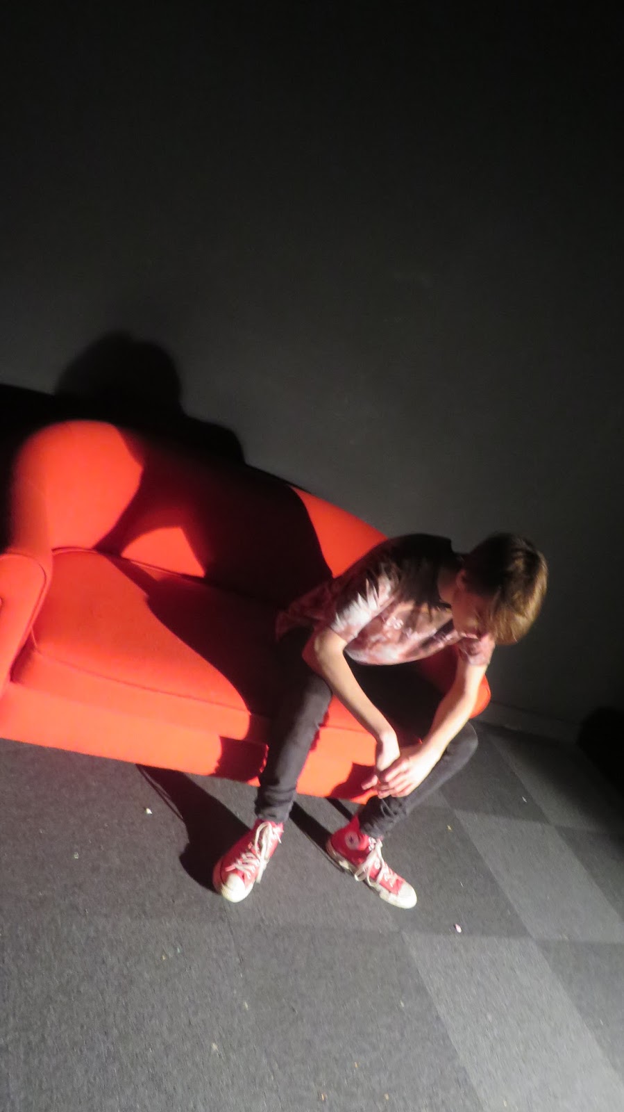
In these we used close up lightning to add definition to the shapes in the photo which is Adam's face. The different shades on the eye's the one eye is really lit and the other one can be barely seen. This adds a massive atmosphere of uncertainty and dis trustfulness which leads to the fear which is mostly shown in German expressionism and thats the attitude they want to present to the viewer.

Idea Development
 I used my sketches to start generating ideas, i used the idea of stairs because it gives off an idea that its leading you somewhere and because of the colour scheme black and white it doesn't seem positive it seems spooky. The colours black and white make things seem spooky and creepy because its the difference of two clashing the good and the bad the pure and the unknown, also they are such bold colours they both stand out and clash even more.
The smoke effect I added to my sketch adds a mysterious feel to my drawing, it makes you feel there is no way out and that the stairs are the only way. Further more inside the dark realm the stairs that are all mixed up this shows much uncertainty that you don't know where it's going to lead which form anxiety which is what emotion is caused by most German expressionism pieces. 


Final Idea

For my final piece i was inspired by Alice and Wonderland when she falls down the rabbit hole. The reason why i went with this theme is because its dark and creepy which will suit the theme to the project. Also it gives me a straight forward point on the image, where the eye will be automatically sent on the image. Rule of thirds is used in this as the bigger objects in the image are separated into different boxes on the rule of thirds. I have kept the to the main theme of colour as it,s the most effect and gives of more atmosphere.
 |
I've added more detail to make is seem even more like a rabbit hole, for example i added dots of light they get small closer to the middle of the spiral to add effect. Further more the windows add effect as they get closer to the points that are closer to the eye.  Also I noticed that my vocal point is the the style of a hypnotic style which is common with German expressionism.   |

Evaluation
The project was about the art style around German expressionism and the influence it has to the people viewing the art. Our task was too take the inspiration we found in German Expressionism and turn it into an environmental piece of art. I was more influenced by the emotions that were shown in the work, the main emotions I found in there art work much fear and sadness. These emotions were shown because most of the art work was inspired by the destruction and poverty that was happening in Germany art the time. The main style I liked was the dramatic and bold art work that stood out and caught your attention as soon as you lay eyes onto it, further more I like the pieces that told a story with it that's why my final work had the sense of 'where is this black hole taking you' it makes the viewer think more and wonder more into there imagination and the core of art is imagination. The main artist that inspired me was Otto Dix, the art piece that stood out for me was the German soldiers that are wearing the gas masks, that art showed many emotions and fears and you could sense the horror of war in it. The issues I had was in his art work he showed emotions through characters, where as we were making environmental based art so I had too try and show the emotions in scenery. I researched colour theory to help me get over this issue as i showed the same emotions through the colours instead of facial expressions and body language instead. Colours can say a lot about the mood in everything. My primary research was the photography I did with our group that taught me a lot about shadows and how to form them and the effect it has on the the image itself. My secondary research was the research on artists and the history behind German expressionism, the history taught me how to create the emotions i wanted to achieve in my drawing. I used Photoshop to create my final piece. The main materials i used was a basic brush and changed the opacity of it the get the smoky effect, the swirl I made was done through editing a normal shape into a spiral shape and then making it seem more smoky. Chris first taught me how to create that effect with a basic shape first then I successfully did it myself.
In my work I didn't like the lack of detail i put into the windows, I thought If i added more detail it would be more effect to the drawing. I could show the full extent of my art skills on the windows. The way I would add more detail is by making the frame of the window more detailed by added maybe wood mars on the frame more over i would of added an effect to make it look like there was glass in the window. The main thing i like about my art work is the 3D effect even thought it's 2D, further more I really like the way I captured the emotions in my art work. The reasons why I like this is because it really captures the image that German Expressionism artists wanted to portray in there art. Furthermore I like the way I used the lighting source and how it added affect to the sense it makes you feel like your falling into a black hole also the swirl of smoke also adds to that effect, Chris showed me how to create that effect then I made it myself so I knew how to do it in the future. To make the creative process easier I could have made more sketches so I could have more ideas and try new styles, I would spend more time on the drawing next time so I can achieve a higher level of drawing and show my skills much more, I think I spent way to long on the research but I still created a good standard piece of art. I feel like i did research enough because I was able too put what I learned into my art pieces and that shows, from the colour theme and how effect I used them. Also the style of my work shows the influence from German expressionism. I did manage time well because I had time to go over my work at the end to double check on everything. I wanted to experiment more with my ideas but I was still able to generate a good idea. The evidence of this is on my blog, I really enjoyed this project overall it taught me a lot out emotions in art and how to use 2 basic colours effectively.
No comments:
Post a Comment